project
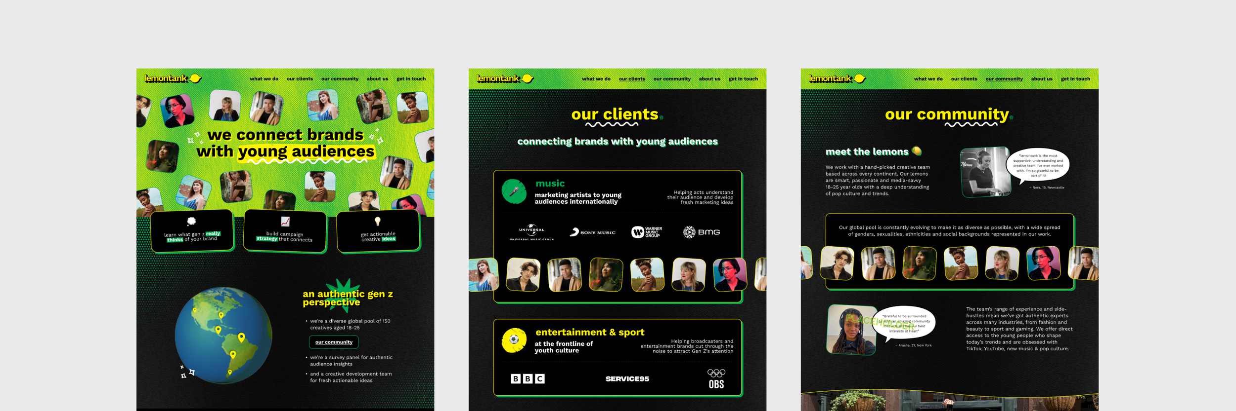
lemontank


who are they?
A survey panel for authentic audience insights made of a diverse global pool of 150 creatives aged 18-25.
the brief
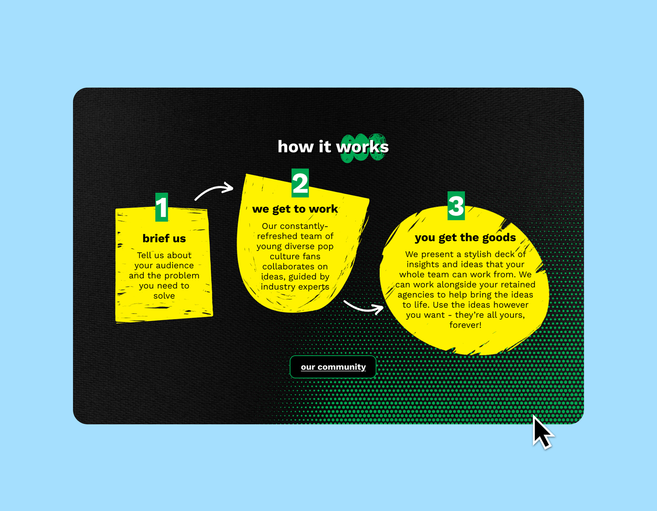
Update and streamline lemontank’s branding to develop into a new website, speaking directly to potential clients who want to work with their Gen Z writers room.
the process
I reviewed Lemontank’s existing brand to understand what still worked and what felt outdated. From there, I overhauled the brand guidelines, adding the missing elements needed for clearer positioning and stronger visual consistency. I then rolled the new direction out across a modernised, refreshed website.
the results
I’ll let the lemontank founder, Jacob, take it from here. “Theo has been instrumental in building the lemontank brand, and every project can be levelled up hugely by involving them. They have the most wonderful eye for great design, attention to detail, and delightful finishing touches. Our whole team feels so lucky to get to work with them!”
See the site at lemontank.com